Line graphs provide an excellent way to map independent and dependent variables that are both quantitative. When both variables are quantitative, the line segment that connects two points on the graph expresses a slope, which can be interpreted visually relative to the slope of other lines or expressed as a precise mathematical formula.
Scatter plots are similar to line graphs in that they start with mapping quantitative data points. The difference is that with a scatter plot, the decision is made that the individual points should not be connected directly together with a line but, instead express a trend. This trend can be seen directly through the distribution of points or with the addition of a regression line. A statistical tool used to mathematically express a trend in the data.
Line graphs are like scatter plots in that they record individual data values as marks on the graph. The difference is that a line is created connecting each data point together. In this way, the local change from point to point can be seen. This is done when it is important to be able to see the local change between any to pairs of points. An overall trend can still be seen, but this trend is joined by the local trend between individual or small groups of points. Unlike scatter plots, the independent variable can be either scalar or ordinal. Line graphs can be created with either the Line Graph type or with (XY) Scatter.
An xy-line graph shows the relationship between your dependent and independent variables when both are numerical and the dependent variable is a function of the independent variable. (In Microsoft Excel, choose the "XY (scatter)" chart type, and then choose a sub-type that does draw a line.)
A time-series plot can be used if your dependent variable is numerical and your independent variable is time. (In Microsoft Excel, the "line graph" chart type generates a time series. By default, Excel simply puts a count on the x-axis. To generate a time series plot with your choice of x-axis units, make a separate data column that contains those units next to your dependent variable. Then choose the "XY (scatter)" chart type, with a sub-type that draws a line.)
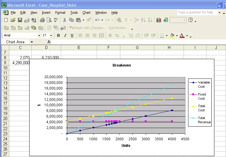
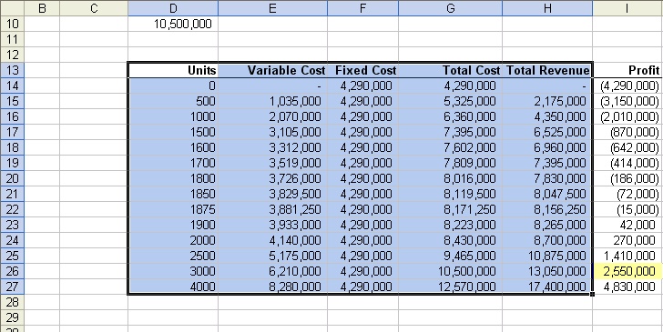
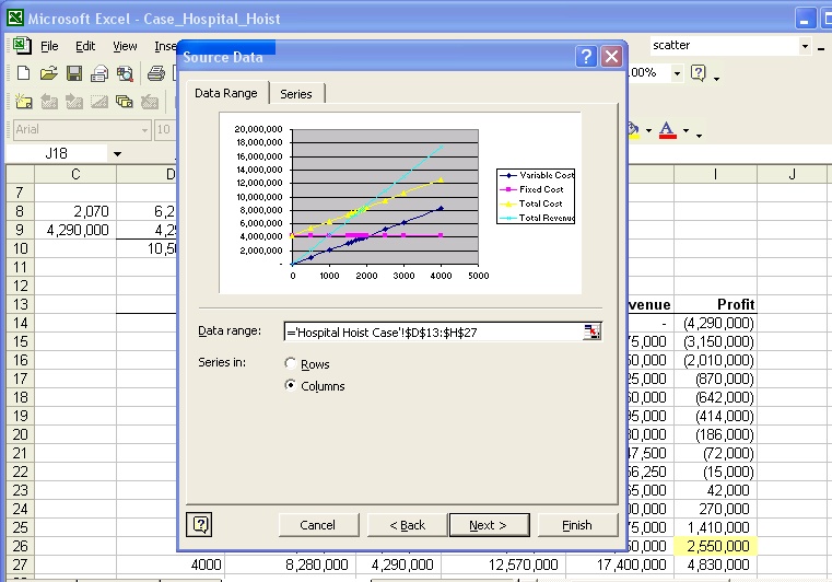
Example: If you look at the Breakeven analysis & Influence diagram exercise (Hospital Hoists, Inc.), you need to draw the XY(scatter) chart. Please go ahead and download the Excel spreadsheet.
You need to draw the XY(scatter) chart to show the Revenue and Total Cost vs. Units Sold. You'll need to do the followings:
1) Identify the range of data that you're going to use to draw the XY(scatter) chart
2) Select Chart Wizard
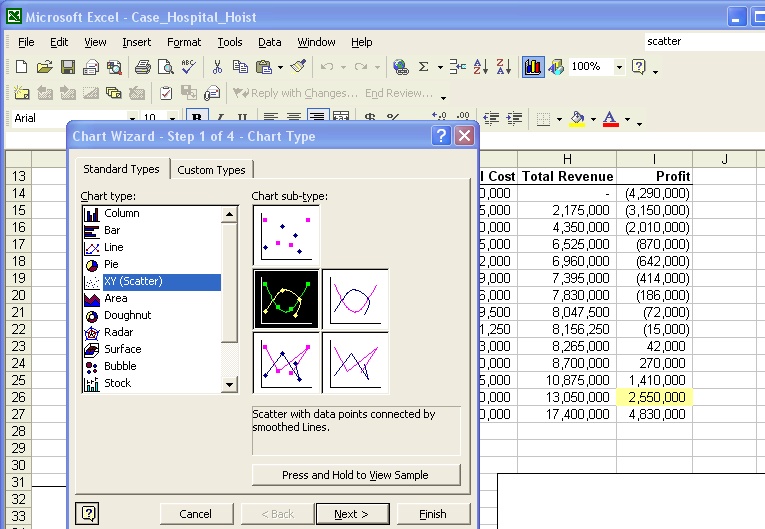
3) Select the Chart Type. When you finish, select NEXT.
4) Enter the data range. When you finish, select NEXT.
5) Enter the chart title, x-axis and y-axis. When you finish, select NEXT.

6) You're going to see the XY(scatter) chart. Please try to identify the breakeven point.